


Why same company stock charts(price curves) looks different?
Sep 16, 2019 at 10:15
432 Visualizações
3 Replies
Sep 16, 2019 at 10:15
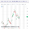
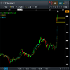
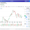
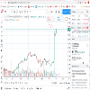
Does anyone know why stock charts looks different depending on the broker you use? I mean; same company two totally different charts(price curves). I added two charts here, hopefully they're visible. Both pictures are weekly charts and company is TCF FINANCIAL CORP. They look totally different in cmc markets compared to chart on finance.yahoo.com
Anexos:
Membro Desde Sep 16, 2019
11 posts
Sep 16, 2019 at 10:48
You sure they are the same company? The prices are different too

*Uso comercial e spam não serão tolerados, podendo resultar no encerramento da conta.
Dica: Postar uma imagem/URL do YouTube irá incorporá-la automaticamente no seu post!
Dica: Insira o sinal @ para preencher automaticamente um nome de utilizador que participe nesta discussão.


