


Why same company stock charts(price curves) looks different?
Sep 16, 2019 at 10:15
430 Visa
3 Replies
Sep 16, 2019 at 10:15
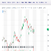
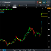
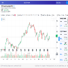
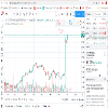
Does anyone know why stock charts looks different depending on the broker you use? I mean; same company two totally different charts(price curves). I added two charts here, hopefully they're visible. Both pictures are weekly charts and company is TCF FINANCIAL CORP. They look totally different in cmc markets compared to chart on finance.yahoo.com
Bilagor:
Medlem sedan Sep 16, 2019
11 inlägg
Sep 16, 2019 at 10:48
You sure they are the same company? The prices are different too

*Kommersiell användning och skräppost tolereras inte och kan leda till att kontot avslutas.
Tips: Om du lägger upp en bild/youtube-adress bäddas den automatiskt in i ditt inlägg!
Tips: Skriv @-tecknet för att automatiskt komplettera ett användarnamn som deltar i den här diskussionen.


