


Advertisement
Why same company stock charts(price curves) looks different?
Sep 16, 2019 at 10:15
643 Paparan
3 Replies
Ahli sejak Mar 11, 2014
3 hantaran
Sep 16, 2019 at 10:15
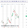
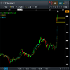
Does anyone know why stock charts looks different depending on the broker you use? I mean; same company two totally different charts(price curves). I added two charts here, hopefully they're visible. Both pictures are weekly charts and company is TCF FINANCIAL CORP. They look totally different in cmc markets compared to chart on finance.yahoo.com
Lampiran:
Ahli sejak Sep 16, 2019
10 hantaran
Sep 16, 2019 at 10:48
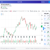
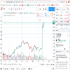
You sure they are the same company? The prices are different too
Ahli sejak Mar 11, 2014
3 hantaran
Sep 16, 2019 at 10:57
here is a better picture where you can see the name of the company
Lampiran:

*Penggunaan komersil dan spam tidak akan diterima, dan boleh mengakibatkan penamatan akaun.
Petua: Menyiarkan url gambar/youtube akan menyisipkannya secara automatik dalam siaran hantaran anda!
Tip: Taipkan tanda @ untuk melengkapkan nama pengguna yang menyertai perbincangan ini secara automatik.


