


Advertisement
Why same company stock charts(price curves) looks different?
Sep 16, 2019 at 10:15
644Lượt xem
3 Replies
Sep 16, 2019 at 10:15
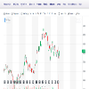
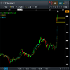
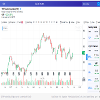
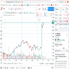
Does anyone know why stock charts looks different depending on the broker you use? I mean; same company two totally different charts(price curves). I added two charts here, hopefully they're visible. Both pictures are weekly charts and company is TCF FINANCIAL CORP. They look totally different in cmc markets compared to chart on finance.yahoo.com
Đính kèm:
Tham gia từ Sep 16, 2019
10bài viết
Sep 16, 2019 at 10:48
You sure they are the same company? The prices are different too

*Nghiêm cấm sử dụng cho mục đích thương mại và spam, nếu vi phạm có thể dẫn đến việc chấm dứt tài khoản.
Mẹo: Đăng ảnh/url youtube sẽ tự động được nhúng vào bài viết của bạn!
Mẹo: Dùng @ để tự động điền tên người dùng tham gia vào cuộc thảo luận này.


