


Advertisement
Why same company stock charts(price curves) looks different?
Sep 16, 2019 at 10:15
695浏览
3 Replies
Sep 16, 2019 at 10:15
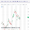
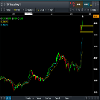
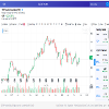
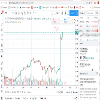
Does anyone know why stock charts looks different depending on the broker you use? I mean; same company two totally different charts(price curves). I added two charts here, hopefully they're visible. Both pictures are weekly charts and company is TCF FINANCIAL CORP. They look totally different in cmc markets compared to chart on finance.yahoo.com
附件:
会员从Sep 16, 2019开始
10帖子
Sep 16, 2019 at 10:48
You sure they are the same company? The prices are different too

*商业用途和垃圾邮件将不被容忍,并可能导致账户终止。
提示:发布图片/YouTube网址会自动嵌入到您的帖子中!
提示:键入@符号,自动完成参与此讨论的用户名。


