


Advertisement
Why same company stock charts(price curves) looks different?
Sep 16, 2019 at 10:15
643 視聴
3 Replies
Sep 16, 2019 at 10:15
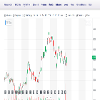
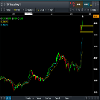
Does anyone know why stock charts looks different depending on the broker you use? I mean; same company two totally different charts(price curves). I added two charts here, hopefully they're visible. Both pictures are weekly charts and company is TCF FINANCIAL CORP. They look totally different in cmc markets compared to chart on finance.yahoo.com
付属品:
Sep 16, 2019からメンバー
10 投稿
Sep 16, 2019 at 10:48
You sure they are the same company? The prices are different too

*商用利用やスパムは容認されていないので、アカウントが停止される可能性があります。
ヒント:画像/YouTubeのURLを投稿すると自動的に埋め込まれます!
ヒント:この討論に参加しているユーザー名をオートコンプリートするには、@記号を入力します。


