


Advertisement
Why same company stock charts(price curves) looks different?
Sep 16, 2019 at 10:15
642 Views
3 Replies
Sep 16, 2019 at 10:15
Does anyone know why stock charts looks different depending on the broker you use? I mean; same company two totally different charts(price curves). I added two charts here, hopefully they're visible. Both pictures are weekly charts and company is TCF FINANCIAL CORP. They look totally different in cmc markets compared to chart on finance.yahoo.com
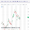
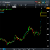
Attachments:
Member Since Sep 16, 2019
10 posts
Sep 16, 2019 at 10:48
You sure they are the same company? The prices are different too

*Commercial use and spam will not be tolerated, and may result in account termination.
Tip: Posting an image/youtube url will automatically embed it in your post!
Tip: Type the @ sign to auto complete a username participating in this discussion.


