


Advertisement
Why same company stock charts(price curves) looks different?
Sep 16, 2019 at 10:15
Vues 695
3 Replies
Sep 16, 2019 at 10:15
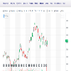
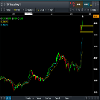
Does anyone know why stock charts looks different depending on the broker you use? I mean; same company two totally different charts(price curves). I added two charts here, hopefully they're visible. Both pictures are weekly charts and company is TCF FINANCIAL CORP. They look totally different in cmc markets compared to chart on finance.yahoo.com
Fichiers joints:
Membre depuis Sep 16, 2019
posts 10
Sep 16, 2019 at 10:48
You sure they are the same company? The prices are different too

*Lutilisation commerciale et le spam ne seront pas tolérés et peuvent entraîner la fermeture du compte.
Conseil : Poster une image/une url YouTube sera automatiquement intégrée dans votre message!
Conseil : Tapez le signe @ pour compléter automatiquement un nom dutilisateur participant à cette discussion.


