


Advertisement
Why same company stock charts(price curves) looks different?
Sep 16, 2019 at 10:15
644 การดู
3 Replies
Sep 16, 2019 at 10:15
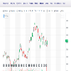
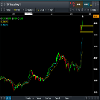
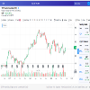
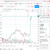
Does anyone know why stock charts looks different depending on the broker you use? I mean; same company two totally different charts(price curves). I added two charts here, hopefully they're visible. Both pictures are weekly charts and company is TCF FINANCIAL CORP. They look totally different in cmc markets compared to chart on finance.yahoo.com
ไฟล์แนบ :
เป็นสมาชิกตั้งแต่ Sep 16, 2019
10 โพสต์
Sep 16, 2019 at 10:48
You sure they are the same company? The prices are different too

*การใช้งานเชิงพาณิชย์และสแปมจะไม่ได้รับการยอมรับ และอาจส่งผลให้บัญชีถูกยกเลิก
เคล็ดลับ: การโพสต์รูปภาพ/youtube url จะฝังลงในโพสต์ของคุณโดยอัตโนมัติ!
เคล็ดลับ: พิมพ์เครื่องหมาย @ เพื่อป้อนชื่อผู้ใช้ที่เข้าร่วมการสนทนานี้โดยอัตโนมัติ


