


Advertisement
Why same company stock charts(price curves) looks different?
Sep 16, 2019 at 10:15
644 Zobrazení
3 Replies
Členom od Mar 11, 2014
3 príspevkov
Sep 16, 2019 at 10:15
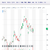
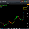
Does anyone know why stock charts looks different depending on the broker you use? I mean; same company two totally different charts(price curves). I added two charts here, hopefully they're visible. Both pictures are weekly charts and company is TCF FINANCIAL CORP. They look totally different in cmc markets compared to chart on finance.yahoo.com
Prílohy:
Členom od Sep 16, 2019
10 príspevkov
Sep 16, 2019 at 10:48
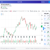
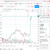
You sure they are the same company? The prices are different too
Členom od Mar 11, 2014
3 príspevkov
Sep 16, 2019 at 10:57
here is a better picture where you can see the name of the company
Prílohy:

*Komerčné použitie a spam nebudú tolerované a môžu viesť k zrušeniu účtu.
Tip: Uverejnením adresy URL obrázku /služby YouTube sa automaticky vloží do vášho príspevku!
Tip: Zadajte znak @, aby ste automaticky vyplnili meno používateľa, ktorý sa zúčastňuje tejto diskusie.


