


Advertisement
Why same company stock charts(price curves) looks different?
Sep 16, 2019 at 10:15
644 Просмотры
3 Replies
Участник с Mar 11, 2014
3 комментариев
Sep 16, 2019 at 10:15
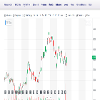
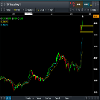
Does anyone know why stock charts looks different depending on the broker you use? I mean; same company two totally different charts(price curves). I added two charts here, hopefully they're visible. Both pictures are weekly charts and company is TCF FINANCIAL CORP. They look totally different in cmc markets compared to chart on finance.yahoo.com
Приложения:
Участник с Sep 16, 2019
10 комментариев
Sep 16, 2019 at 10:48
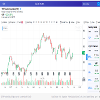
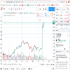
You sure they are the same company? The prices are different too
Участник с Mar 11, 2014
3 комментариев
Sep 16, 2019 at 10:57
here is a better picture where you can see the name of the company
Приложения:

*Коммерческое использование и спам не допускаются и могут привести к аннулированию аккаунта.
Совет: Размещенные изображения или ссылки на Youtube автоматически вставляются в ваше сообщение!
Совет: введите знак @ для автоматического заполнения имени пользователя, участвующего в этом обсуждении.


